
Portfolio
Hi, my name is Nick Mosher. I'm a Senior User Experience Designer, husband, and father. Here I have collected a small sample of my work as a designer, researcher, futurist, and innovator. Let me know if you have any questions: nick@mosher.me.
This portfolio will highlight each stage of my design process. However, I understand that each project is unique and requires its own customized process. I hope to introduce you to my thoughts about each stage as well as provide an example artifact.
Stages of Design
Design Futures
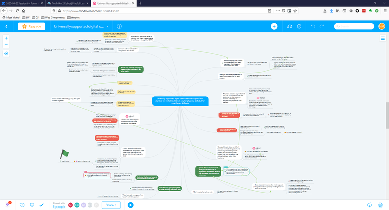
The image was taken from a Futures Thinking workshop I facilitated at the AAFP. It is a map of possible consequences to a scenario our team wrote on day six of the workshop. In "Draw Out consequences" the team works to identify impacts of decisions and actions that others may take in response to a scenario. This technique chains if-then statements to form a more complex scenario.
10-30 Years Ahead
Futures Thinking does not predict the future. Rather, it is a cross-disciplinary approach to considering potential futures by exploring trends and drivers for change. I facilitate Futures Thinking workshops that provide a framework for stakeholders with decision-making power to imagine possible futures concerning a product, company, or industry.
Each of the 16 workshop curricula I employ typically last a day and are flexible and adaptable to the needs of the business area. The workshops are based on leading futurist Bob Johansen's foresight to insight to action cycle. They help business and design teams determine:
- The possible, probable, and preferable futures for your business unit or product.
- The ideal future you want to drive towards.
- A roadmap towards that future, including a process to proactively shape change.
By encouraging Futures Thinking through these workshops, I can help a business gain vision, understanding, clarity, and agility in a user-centered design world where the users themselves are constantly changing.
Customer Interviews
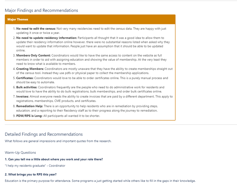
The screenshot above shows the format of my standard interview report template. I try to keep it short and to the point. It also helps to link or embed clips from the session. This allows for quick scanning by busy people and more in-depth reviews when needed.
1 Month Before Development
Interviewing customers, members, or users is a vital part of the design and product development process. By understanding the needs of our users, we can build better software the first time. I have conducted customer interviews through contextual inquiry, phone interviews, zoom interviews, and face to face interviews. All forms have their benefits.
User interviews are not usability tests. They are 1:1 conversations where the researcher can begin to understand users' environment, needs, tasks, and more. It helps uncover issues that normally wouldn't be known until much later in the development cycle, saving time and money.
I find the most productive time to run user interviews is the beginning of the project or when a product needs a good revamp. These interviews can produce new insights and interesting product feature ideas, but only if the team understands the research. The best method for sharing information from interviews that I have found is to have team members watch the interviews. However, team members are often unavailable for the actual interviews. I have also found that most people, while well intentioned, do not find the time to watch recorded sessions. To remedy this I proactively schedule debriefings with team members where I discuss my findings from and show footage of the interviews. This has been effective in building empathy for our end users among team members and has helped them center the users' needs as they develop products.
Personas
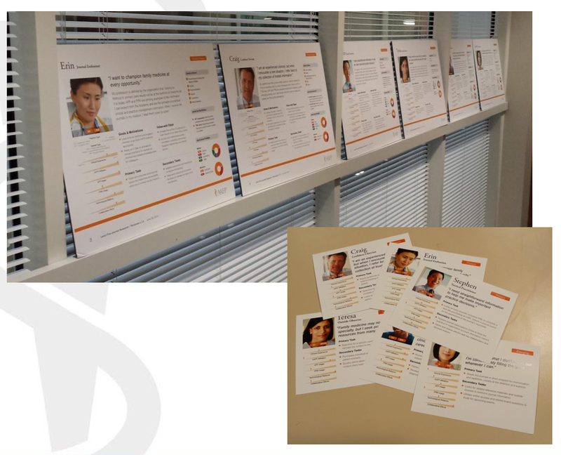
The screenshot above show two variations of persona artifacts used for meetings. Team members each received the small cards and used them when building stories and developing features.
1 Month Before Development
Personas are a common deliverable in usability work. They are characters simulated from user research that offer the project team a picture of target users to reference in their user stories, how they're likely to use the product, and what they're likely to expect from it. Often the personas have key needs, goals, and demographic information that should correspond to wider groups of real users.
While industry accepts that personas are an invaluable UX tool, I have found that personas are a great tool for about the first two weeks of a project. After that, I have noticed that teams drift away from using personas and it takes a strong effort to keep them relevant. Over the years I tried several techniques to strengthen my teams' focus on the developed personas, including: posters on the walls, table tents on the meeting room tables, playing cards, and even large foam boards that I would carry into meetings. Each technique had some small benefit but was ultimately discarded over time for lack of use.
In the end, I would suggest that UX teams not spend much time on personas if their teams are not receptive to them. I have found that the real empathy teams feel for actual users is a much stronger and more lasting motivator than simulated personas to keep user interests at the heart of projects. I help teams build empathy with real users by ensuring team members participate in, watch, and help review actual user feedback. This can be done in user interviews, usability testing, and even on support calls.
Workflow

I displayed the workflow shown above outside my cube for over a year. This 12 foot long poster is the simplified version of our education accreditation product. This incredibly complex application required this workflow map to even keep track of where we were in any given scenario or development task. The team found it so useful that I rolled it up and carried it, physically, into our agile sprint ceremonies for months. This particular version was the 8th major version and 14th minor update. A digital version lives on to this day and we update it as we add new features to the app.
3 weeks Before Development
Workflow maps, system diagrams, and journey maps clarify the flow of a product, process, or user journey. Each of these outcomes become vital to building a good, full product that doesn't leave any dead-ends or infinite loops for the users to have to navigate.
Each tool requires a deep understanding of the user, the business needs, and the technical restraints. Through my career I have worked as a product owner, developer, researcher, and designer. I bring a unique perspective and history from all angles of the product development cycle. This allows me to ask deeper questions and understand more opportunities for additional discussion.
These maps can provide much more clarity than a wireframe or prototype when questions about process come up. I have found that they even provide a great shortcut for getting into a specific screen in a workflow.
Card Sorts
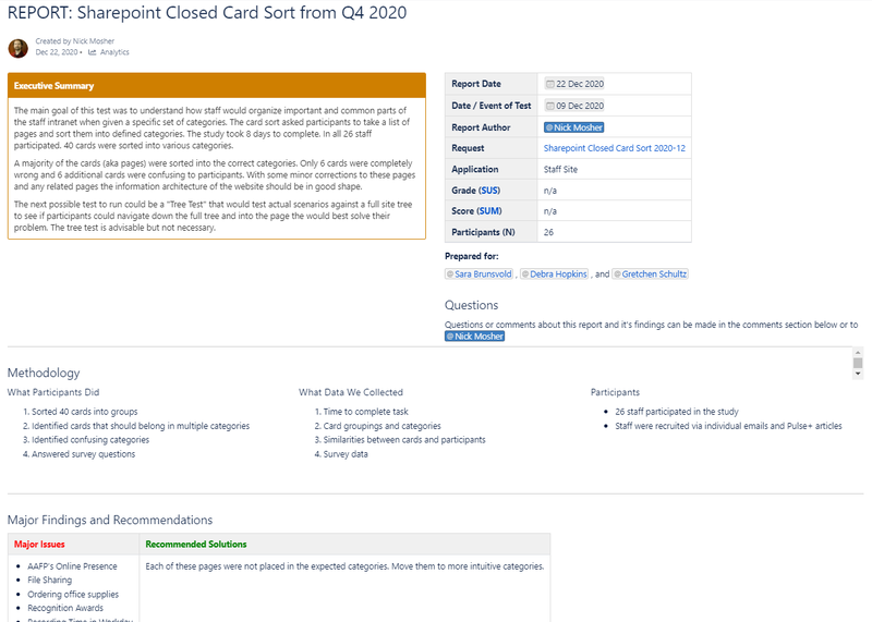
The screenshot above provides an example analysis of a card sort I completed on our staff intranet in December 2020. Our product owner had some extra time while she was working on the technology, and we were able to help her re-arrange the menus into a much more intuitive structure. This report was vital in helping her make good decisions about her content.
3 weeks Before Development
Card sorts help you build intuitive structure into your application or website, know your users better, and help you find the right labels for sections of your information architecture.
Teams use open and closed card sorting to understand how people think of a particular data set. Card sorts are usually used for information architecture but can help teams group items intuitively for their users in many varied circumstances.
Typically, when teams are looking at the structure of their content, they are in a hurry to get into the next step. By using online tools like UserZoom, I have been able to complete card sort studies in days and have initial results back to teams in less than a week. This helps the team keep moving quickly without being bogged down by another research task.
Information Architecture (I.A.)
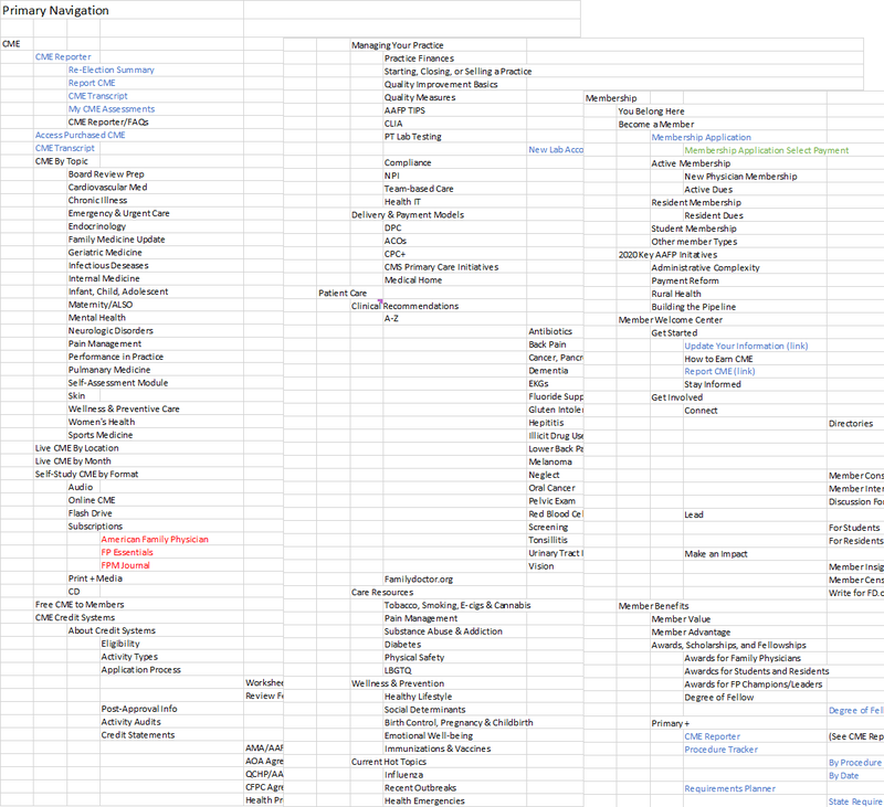
The screenshot above is a section of aafp.org's massive I.A. as displayed in excel. Product teams used this to ensure their pieces all interacted successfully with the rest of the site.
3 weeks Before Development
Information architecture (I.A.) is arguably the most vital part of a website's success. Without a good, intuitive organization of your content, your users will have to rely on Google or in-site search. This often leads to frustration, or worse, clicks onto other websites. You need to speak your users' language to make it easy for them to accomplish their tasks.
During our 2020 redesign I audited the overall I.A. of the aafp.org website and all applications. I found that our site was siloed into sections based on the technology used to build each section or the different teams in charge of the content of each section. This created an I.A. with dead ends and circular paths that would lead users back to where they'd started. Applications were placed in I.A. locations that made sense to product owners, but not to the AAFP member users. It was a challenge to understand the greater picture of how the various components of the I.A. functioned as a whole.
A world-famous design firm helped us with the website redesign, however we still needed someone with a deep understanding of the AAFP's users, its systems, and its tools to create the best integrated experience of our website. I produced a seamless solution that integrated all these areas into one cohesive experience for our users while still allowing the technical systems to stand alone. Users don't have to know that some apps were vendor built, some apps are in .net, and some in JAVA. They all work together because they interface with our overall I.A.
Tree Testing
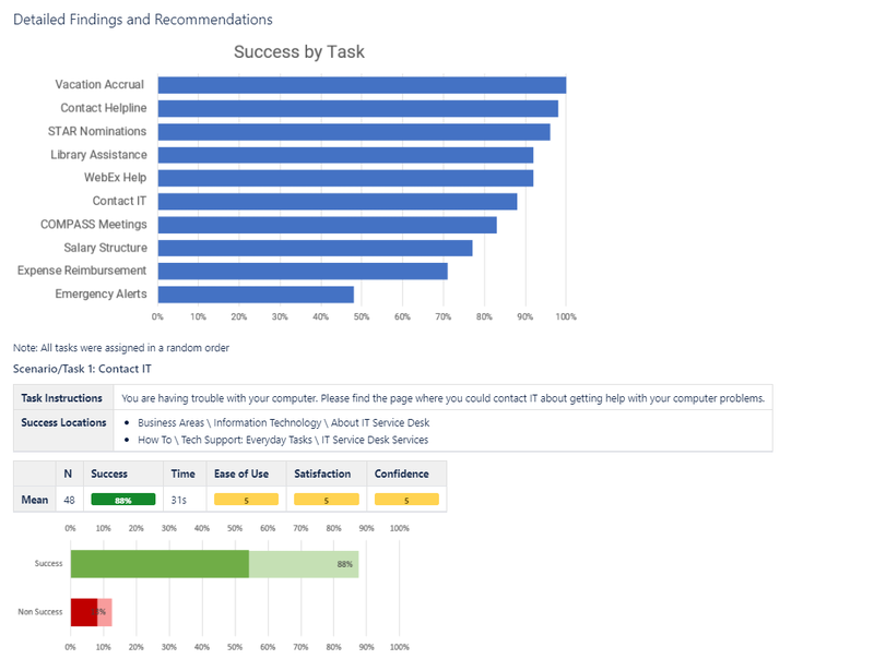
The screenshot above shows an example of the results report I delivered for a recent tree testing study we completed on our new staff intranet portal. This report took only a few hours to produce and gave the product owner useful feedback to move forward.
3 weeks Before Development
Tree testing is the next step for testing an information architecture after card sorts help you build it. In a tree test you ask participants to try to find a page that would likely help them complete their realistic task.
By asking participants to click through your site before you complete any visual design, you can quickly get data about how successful your site organization can be without any visual clues or distractions. It allows you to get a clean view of the basic usability of your website.
Just as with card sorts, teams are usually in a hurry to understand their information architecture. They want to get into the designs as soon as possible so waiting several weeks for a study is not ideal. For this reason, I try to get these tests scheduled, run, and analyzed faster than usual studies. It often helps to schedule tree testing within a couple of days after the card sorts so that we can keep moving quickly.
Wireframes
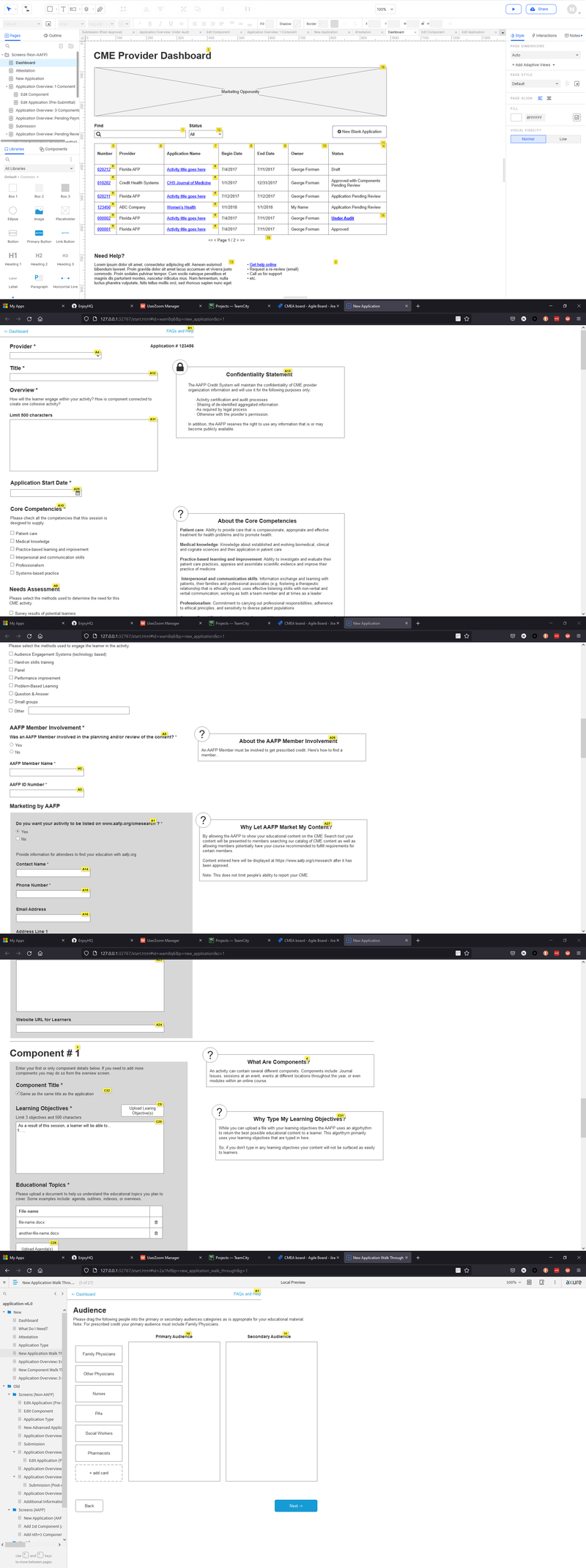
The above images are several screens from the CME Provider Dashboard in Axure RP. This application had over 30 iterations in the wireframes alone.
2 weeks Before Development
I intentionally lead teams through the design process to the point of wireframing before drawing a single bit of the actual interface. Until we understand the problem space it is too easy to fall in love with a solution that isn't going to work for users. However, by the time a team has reached the wireframing stage of a project, I find we've had sufficient time to turn away from our preconceived solutions and absorb a deeper understanding of our users' perspectives.
Wireframing is the point where we can begin to create visuals of our ideas. The goal of this phase is to sketch a solution that might work but it needs to stay rough. Rough sketches or 'wireframes' are useful because you can easily change them, they don't look polished so people are more willing to give you honest feedback, and you haven't wasted a lot of time if you have to throw them out.
I use a brainstorming method like to the one outlined in the book "Sprint: How to Solve Big Problems and Test New Ideas in Just Five Days" by Jake Knapp. First, I collect all the notes and things I've learned through the previous steps. It is important to take some time and make a checklist of important pieces, like business requirements, technology limitations, and user goals, that need to be in the application at this time. I found that if I don't have a checklist, I can overlook a fundamental part of the puzzle.
Next, I sketch out as many possible solutions as I can think of. This often results in 8-20 different sketches. I have learned that the first solution is never the best, but it is the easiest to fall in love with. These 8-20 rough solutions don't have to be fully fleshed out. My goal is to get ideas out of my head so that I can begin to the see them all together.
Next, I make a first draft wireframe of the application using the best ideas from the sketches. This draft is almost never the final wireframe. Again, it is easy to fall in love with initial drafts, but great designs take time and multiple iterations to incubate. Once this draft is complete, I step away from it, usually for a day. However, a walk-in nature often does the trick. This allows ideas to settle and gives me a bit more perspective.
Next, I come back and refine the wireframes or re-design them completely. Sometimes I need a few more drafts before I feel like I can show it to another person.
Next, I share the wireframes with stakeholders individually. I find that 1:1 feedback helps to elicit multiple opinions and perspectives, rather than a single consensus opinion that a group meeting can generate. . I start by meeting with the technical people like developers or QA specialists. Technical people tend not to get fixated on one design and can provide me a quick indication as to the feasibility of the solution. If I designed something that isn't technically possible, this step can save us some heartache later in the project. After that, I will show it to businesspeople for feedback and to check to make sure all the requirements are accounted for.
These meetings often require me to make additional adjustments the wireframes. While I am still meeting with stakeholders, I also prepare the wireframes to be shown to our users in the first round of usability testing.
Usability Testing (round 1)
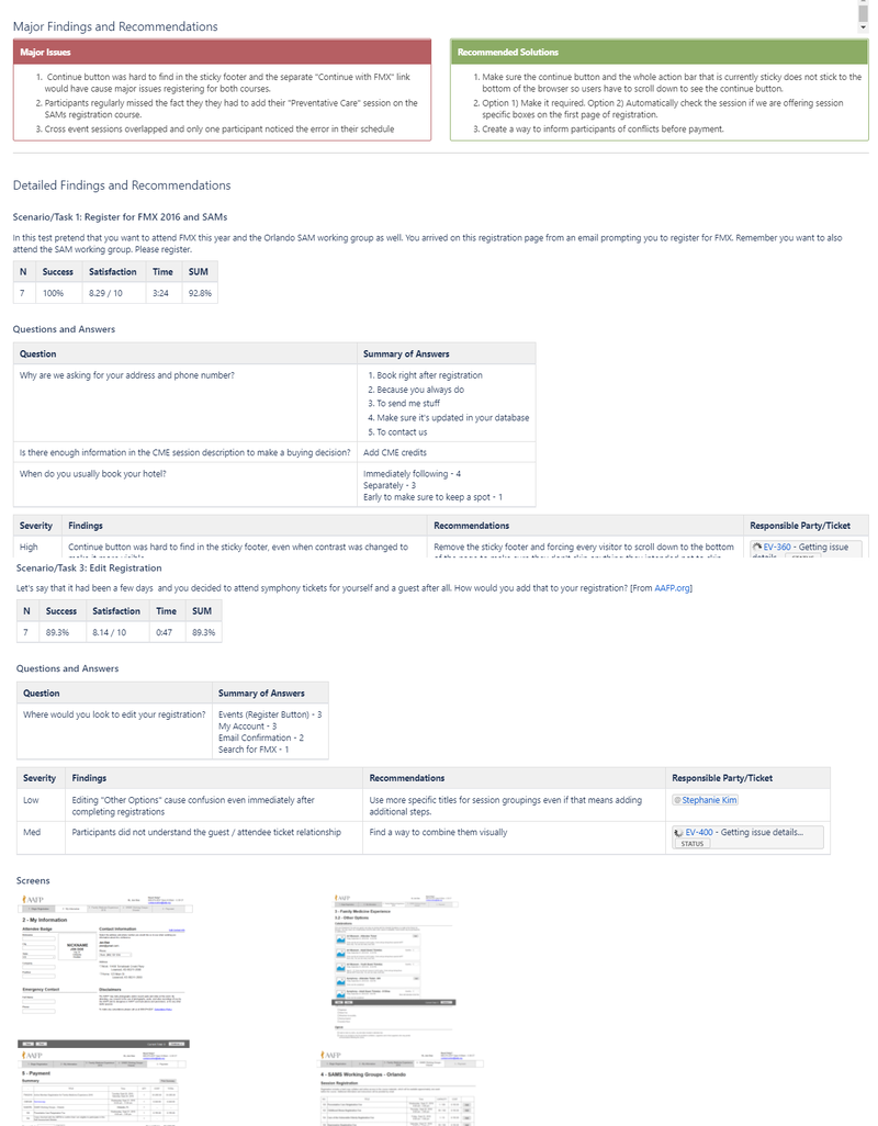
The above image depicts one of my full reports generated through the usability testing process. These reports always go through a standard template so that they are easier to read.
2 weeks Before Development
Usability testing is the heart and soul of User Experience Design. Without it we are only doing design work. Without it we have no grounding. Without it we don't understand how to truly serve our users.
In usability testing we bring our designs to the real world and see how and if people use your application. Tools like UserZoom allow remote testing of designs without incurring travel expenses. It is vital to meet 1:1 with study participants and helpful to have members of your team watch the tests.
By doing several rounds of usability testing, I can test with fewer people and get responses quickly. For this first round, test participants use a rough wireframe of our application. There may be bugs and prototype issues that take a little bit of skill to navigate, so I advise teams not to get discouraged. We learn a lot about the designed solution even in this rough, buggy state.
I ask users to complete realistic tasks on these wireframes. These tasks are taken from the use cases provided by the business and the previously performed user interviews. It is vital to my process to pick the top 3-5 tasks only. Yes, there are usually many additional tasks we want people to complete on the application, but focusing on the top tasks ensures the application will work well for the most important items first.
Participants are given a short scenario like "You are planning a weekend trip, but you don't want to add additional miles to your car. Please show me how you would book a rental car for your weekend trip. You plan on leaving Friday and returning Monday." From there I give them the wireframe and watch them try to work through the scenario. This gives us a lot of good information about how they can complete these top tasks.
Immediately after each round of usability testing I email a brief 1-2 paragraph "impressions" report to the stakeholders. I have found that interest in the usability testing peaks just after the testing finishes and quickly dissipates. By providing these "impressions" reports immediately upon completion of the tests I can make sure the usability test has the greatest possible impact on the team.
Next, I must perform a deeper analysis of the usability test findings. I try to get this final report out by the end of the next week so that the design process maintains momentum. I have found that it is important to future designers and product teams to finish a full report. Not many people read these reports initially, but when we must review an application it is helpful to have a full report on hand.
Design Sprints

The photograph shows one of the collaborative sessions of the design sprint week. We fixed all of the artifacts we generated throughout thew week to the wall. This allows us to keep a working memory for reference.
1-2 weeks Before Development
I want to bring up a technique that I've used to condense the months of design work I described above—from workflow to usability, building and testing a prototype —into just one week. This technique is called a 'design sprint' and I helped the AAFP become one of the first organizations to use the design sprint methodology to achieve these rapid results.
I attended the debut of this methodology at the SXSW conference in 2014. This presentation blew me away. I immediately took it back to the AAFP and we began running design sprints within a month. They have been a tremendous resource for us. Whenever a project has a big problem to solve, we use design sprints to get to a possible solution quickly. The tool is further outlined in Jake Knapp's book, "Sprint: How to Solve Big Problems and Test New Ideas in Just Five Days."
I'm amazed at the various outcomes of these sprints. We've had projects that have been huge successes, some that have sadly been retired since, and even one design sprint that lasted only 4 hours. This last example was a great success for the business. By getting everyone together prepared to come up with a solution we were able to realize that no solution was needed. We circumvented months or possibly years of meetings in just four hours of deep discussion. I call that a win!
Visual Design
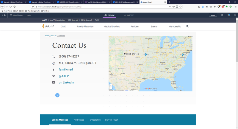
In the above screenshot you can see how I implemented a design of a 'contact us' page. This was created in Axure RP. All links were clickable and the tabs at the bottom of the screenshot all had the appropriate content.
2 Weeks Before Development
After a wireframe or prototype has been tested and confirmed to work in the real world, it is often time to create a full visual design. Design systems make this process much faster. By using design systems, designers can spend more time designing the interactions instead of the color of the buttons. Visual designs are more than just coloring in the wireframes. Designers must understand all the research, design, business requirements, and technical needs of the project in order to create the right design for the application.
I find that if I copy the final wireframe and begin to replace the components on the page with a well-made visual version, I can ensure that nothing is missed along the way. What do I mean by well-made visual versions? This requires a good understanding of the design tools. Axure RP, the tool I like to use most, allows designers to make reusable components, swatches, and interactions. These features allow for a more re-usable design that makes iteration, documentation, and cross-project sharing much easier.
A good visual design helps the development team, business team, and even marketing teams get a good preview of the working application. It is also useful for the next round of usability testing.
Usability Testing (round 2)
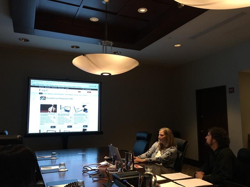
Here I am facilitating an in-person usability test at one of our regular on-site events. We were able to do three to four of these a year before the pandemic.
1 Weeks Before Development
Running a second round of usability testing at this point helps teams get deeper into the application with users. Now that there is a visual design to test it is likely that users can get further into the process than before. Additionally, there are likely several changes that have been made from the wireframes to the visual design. It is helpful to get another round of testing at this point to look for further problems and opportunities.
I insist on testing the top three tasks during this usability test as well. It is okay to add in a few other tasks, but by continuing to focus on the most important tasks we ensure we aren't losing sight of main goals. Additionally, we can begin to measure improvements of the application from test to test.
Development Specs
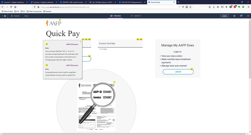
The screenshot above provides an example of design specs that I used in the major aafp.org redesign of 2020. We needed to document the changes to the visual design as we converted technical systems and design systems.
0 Days Before Development
By now we have a really good idea where the design is going and how to solve the initial problems of the application. It is almost time to deliver it to the development teams. However, just dropping off a design to the team can lead to miscommunications, dropped features, or poor implementation. A design specification document helps transition the design into the hands of the development team, regardless of the process being used, and enables a more accurate interpretation of the design into code.
I create design spec documents that define components, list out the business requirements, and detail specific interactions. Providing this information reduces questions from the development team. When I worked as a developer, I found spec documents useful because when my requirements were integrated within the designs, I didn't have to refer to multiple places to find them.
Usability Test (round 3)
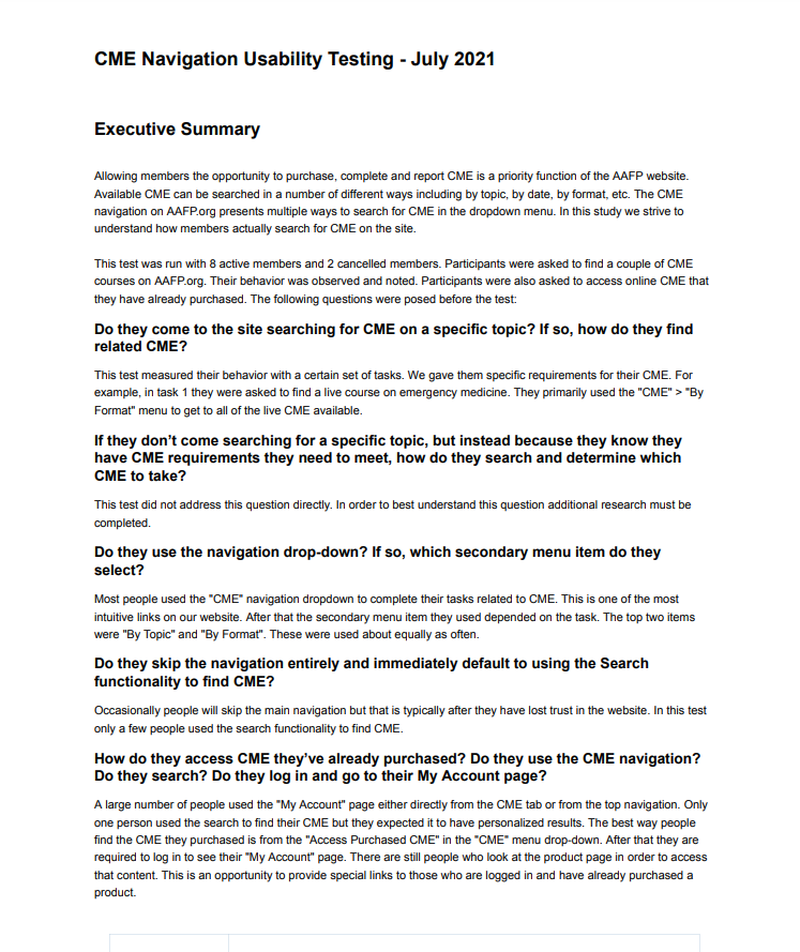
This screenshot is page one of our newest usability testing template. We moved to EnjoyHQ so that we can take advantage of some better integration and share-ability. This product owner provided a list of questions before the usability test that we tried to answer in the test. Click for the full report example.
2-3 Sprints Into Development
This third round of usability testing should be run after the development team has enough of the application completed to be able to run through the top tasks. In this test we hope to learn how the design is being translated by the development team. Additionally, there usually have been additional changes to the application since the last round of usability testing.
This round of usability testing involves 5-7 participants and brings the number of usability participants on the application since the beginning of the project to a total of around 15-20. This means that we have had time to fix the top issues discovered in the tests, validate they have been solved, and discover another round of issues, setting the application up for success.
Design Support
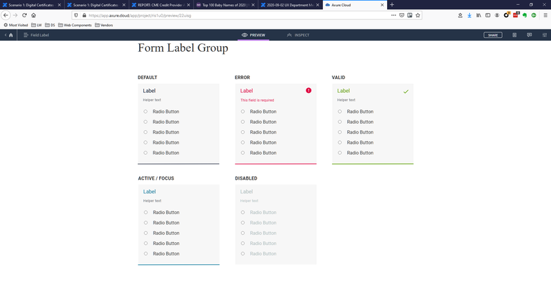
In the screenshot above I laid out the various states of a form field. These sorts of in-depth designs are frequently needed during the design support phase. It helps communicate my full intentions for the design.
All Throughout Development
After we hand the design to the development team for implementation, it is helpful to provide support. By this point in the process, the design team members are experts about the application. They can quickly answer questions without having to reach out to the product owner. Additionally, it is helpful to have a designer available to make any tweaks and changes required because of the development process.
I also request that a member of the design team be in attendance to any sprint UAT sessions. This is a great time to find design bugs since the development team should be going through their work for the sprint.
Acting as design support typically takes little time but can yield much more polished and consistent design work. It also helps everyone on the team stay on the same page throughout the development process.
Benchmark Usability Testing
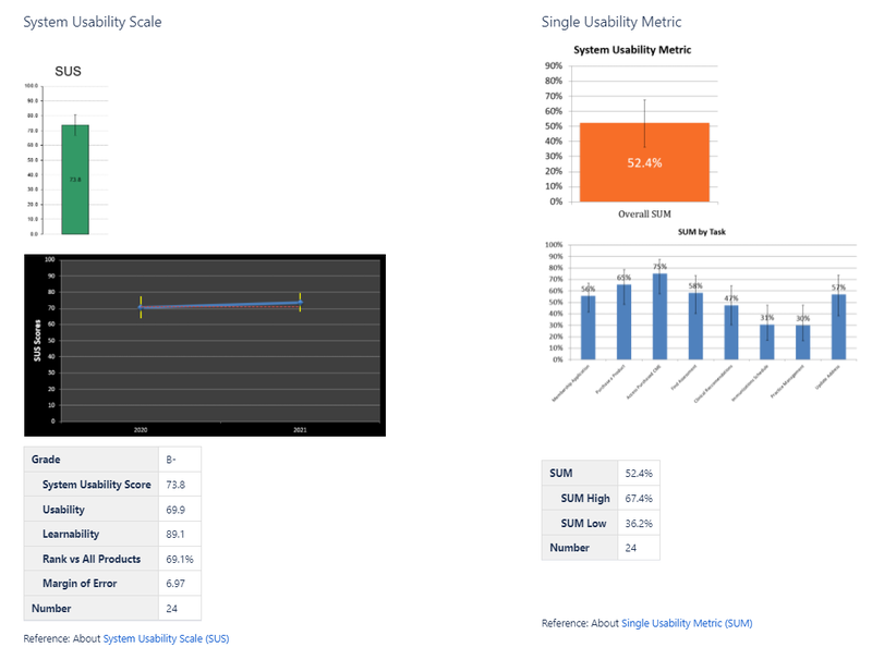
The above screenshot depicts the relative health of aafp.org compared from 2020-2021. The full report (linked from the image) shows item-by-item the top tasks and how they performed from year to year.
After Launch and Yearly
Benchmark usability metrics are important because applications change over time. Not only are there often technology updates, but customers' perceptions change over time. Imagine an application written before the iPhone existed. Even if it was the best, most usable application of it's time, it won't be viewed as such today. For this reason, we need to keep an eye on the perceived usability of the application over time.
Usability testing can offer much more than qualitative insights. There are several quantitative measures such as the SUM, SUS, SUPR-Q, and others that can provide valuable insights about the health of an application. Benchmark usability tests should be run with an unmoderated tool such as UserZoom. These tests also need to have about 20 participants to decrease the error rates for the reported numbers. It is best to run these benchmark tests at least yearly, but they can be run more frequently if the application is being changed a lot. Many teams can also find a way to tie those usability metrics directly to the bottom line, which helps speak clearly to upper management about the health of the application.
I introduced benchmark usability tests to the AAFP in 2019 and we have been running them on our top applications since 2020. These metrics have provided our business owners with valuable information about the health of their applications.